Map:
Each point on this map shows the location of a fire detected in Australia from August 1 to September 30, 2025.
The timeline below displays the number of fires detected each day; as the animation progresses, fire points appear on the map corresponding to that date range, revealing the spatiotemporal patterns of the fires.
The map was created using CARTO.
Data source: NASA FIRMS (LANCE) — VIIRS 375 m Active Fire product and MODIS Active Fire detections.
We acknowledge the use of data and imagery from LANCE FIRMS operated by NASA’s Earth Science Data and Information System (ESDIS) with funding provided by NASA Headquarters.
Fire Patterns Over Time
For this project, we analyzed satellite-based fire detection data from the Kaggle dataset “Fires from Space: Australia and New Zealand”, curated by Carlos Paradis. The underlying source is NASA’s Fire Information for Resource Management System (FIRMS), which collects real-time fire data from the MODIS (Moderate Resolution Imaging Spectroradiometer) and VIIRS (Visible Infrared Imaging Radiometer Suite) satellite instruments.
This dataset includes hundreds of thousands of individual fire detection records collected between 2019 and 2020, a critical period during which Australia experienced some of its most devastating bushfires on record. Each entry includes valuable information such as:
- Geographic coordinates (latitude and longitude)
- Brightness temperature, indicating fire intensity
- Acquisition date and time, which allows us to track fires across time
- Satellite source and confidence level
- Fire radiative power (FRP) as a proxy for combustion strength
We selected this dataset for several reasons:
- Reliability – NASA’s FIRMS data is widely used by scientists, governments, and disaster response teams.
- Granularity – The dataset provides precise spatial and temporal detail suitable for mapping and pattern analysis.
- Relevance – Fire patterns in Australia have far-reaching environmental, social, and political consequences.
- Accessibility – The dataset is openly available on Kaggle and easy to integrate with modern data analysis tools.
Our project uses this data to explore how fire activity varies by region, season, and intensity, and to ask deeper humanistic questions like: Who is most at risk? How can data help communities prepare and respond? By visualizing these patterns and connecting them to lived experience, we aim to make the data not only informative but also actionable and personal.
Visualizations
Daily Fire Detections in September 2019 (Australia)
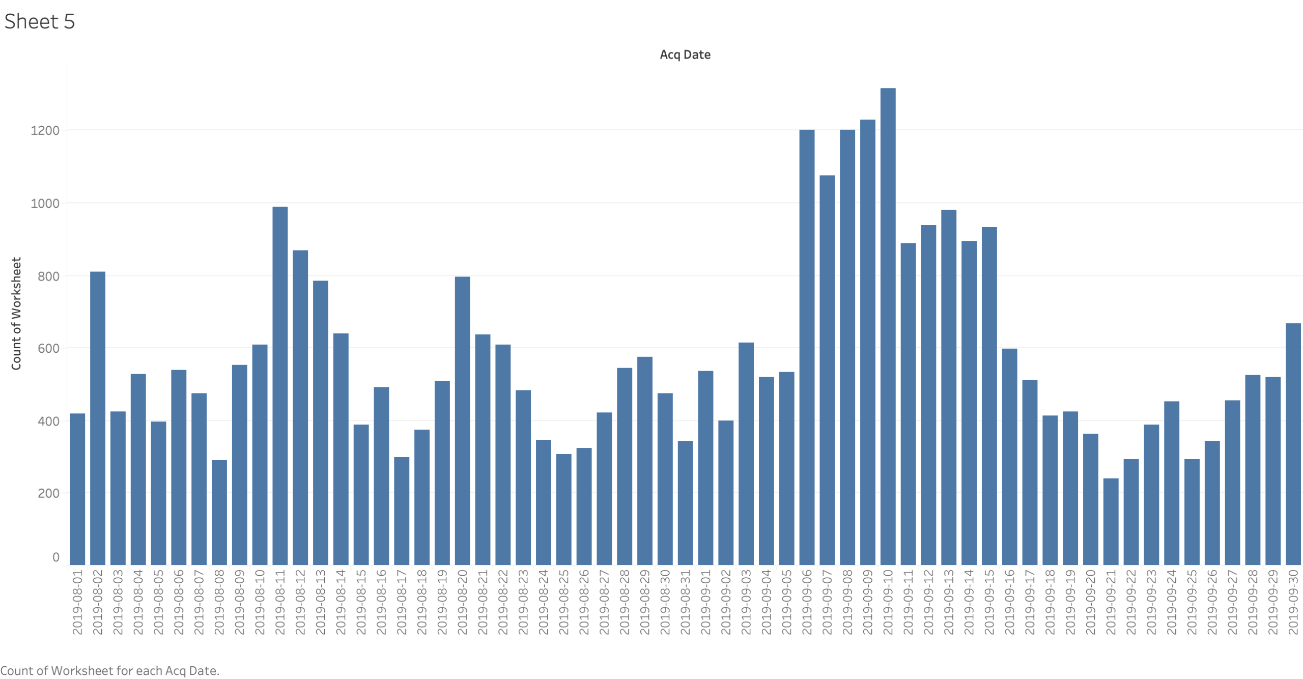
During August to September, the count of wildfires detected each day fluctuated significantly, with two notable spikes on August 11 and between September 7 and 10 when the counts exceeded 1,200 detections per day. These spikes suggest a time frame of heightened fire activity possibly due to dry fuel types, wind patterns, or management or prescribed fires, while mid-to-late August and late September show low and consistent fire counts with less variability, and points to changes in weather or suppression efforts, or a natural fire cycle. These patterns reinforce a rationale for further exploration into what factors related to environmental or human activities may underlie the sharp daily difference in fire activity.
In order to explore the timing of bushfire activity and intensity during the Australian bushfires 2019–20 period, we reviewed daily fire detection data in addition to fire-intensity data recorded through satellites. These charts help us to understand not only the timing of when the most fires were detected but also the fire behavior due to their day and night cycles.
The first bar chart called “Daily Fire Detections in September 2019” reveals considerable variability between the number of fires detected each day. The greatest fire activity occurred on August 11, as well as during periods from September 7 to 10, when detections exceeded 1200 per day. On certain days, fires could have been affected by extreme fire weather (e.g. high winds, low humidity, high fuel loads) even though the degree of those weather conditions is uncertain. You can see, as well, that from mid-to-late August, there were less detections and were much more stable with considerably less variability and fire activity, possibly due to either changes in the weather, or due to suppression although we cannot ascertain which one with certainty. The temporal clustering of intense days of fire brings up many questions about the interaction of natural fire cycles, human influence, and climate-related pressures.
Fire Brightness vs. Radiative Power, by Day and Night
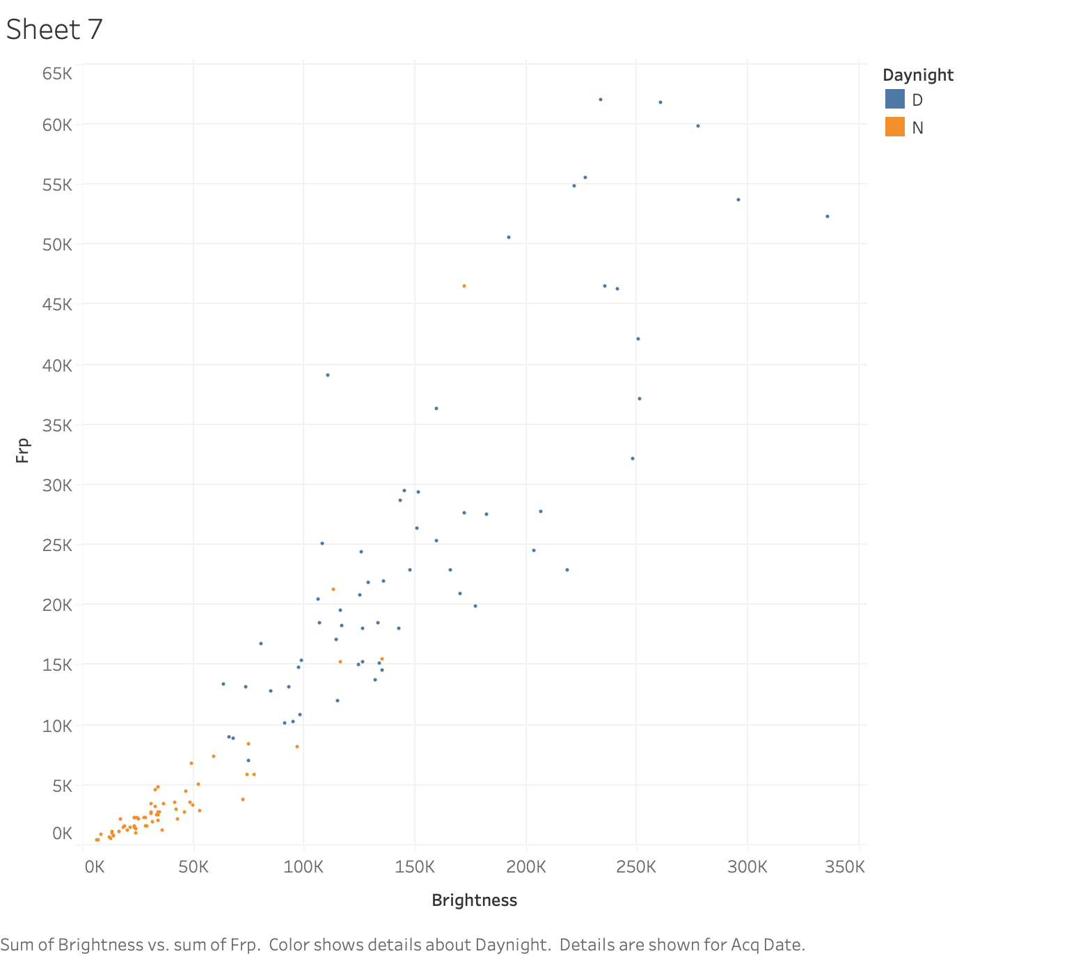
The scatter plot indicates that although fire detections during the day and during nighttime both show a general upward pattern between brightness and FRP, daytime fires (blue) are far more likely to achieve high intensity levels, with some reaching over 50K FRP, while nighttime fires (orange) remain clustered at the lower end of the scale. This pattern may reflect either environmental conditions such as higher temperature and more wind during the daytime or the detection limitations of nighttime satellites, which may not account well for extreme fire behavior. These findings highlight the need to account for time of detection in the analysis of satellite fire data. Time of detection affects our understanding of both wildfire intensity and also visibility.
The second visualization, a scatter plot entitled “Fire Brightness vs. Radiative Power, by Day and Night”, examines intensity of fire using the same satellite-derived measures. A clear upward slope exists between fire brightness and Fire Radiative Power (FRP). However, there is a stark difference between the day and night detections: daytime fires (i.e., the blue dots) often exceed 50,000 FRP, while nighttime fires (i.e., the orange dots) seem to cluster in less bright ranges. This difference could be due to the environmental context – it is likely hotter and windier during the day, resulting in more extreme fires – or sentinels could be limited by their sensitivity when detecting fires at night. Regardless, this reinforces the need to critically evaluate the time-of-day effects in interpreting fire data.
Both visualizations reinforce the necessity of temporal awareness, both in terms of calendar timing and diurnal periods, in understanding wildfire behavior. As time represents one of the most powerful impacts on fire frequency and intensity, understanding how time drives or inhibits fire frequency provides the necessary context for developing suitable management responses and interpreting space-based fire monitoring systems.
Distribution of Fire Radiative Power by Satellite: Aqua vs. Terra (2019)
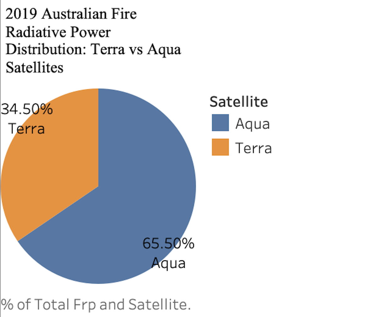
This pie chart shows the total Fire Radiative Power (FRP) detected by the Aqua and Terra satellites during the 2019 Australian wildfires. Aqua recorded about 65.5% of the total FRP, almost double Terra’s 34.5%. This difference is mainly because of when each satellite passes over: Aqua flies over in the afternoon when fires are usually at their strongest, while Terra passes in the morning when fires tend to be less intense. That’s why using data from both satellites together gives a fuller picture: Aqua helps us see the peak fire intensity, while Terra shows us how fires start and grow earlier in the day. Combining both gives us a better understanding of how wildfires develop and helps improve monitoring.
Estimated Impact of 2019–2020 Australian Bushfires on Wildlife, Ecosystems, and People
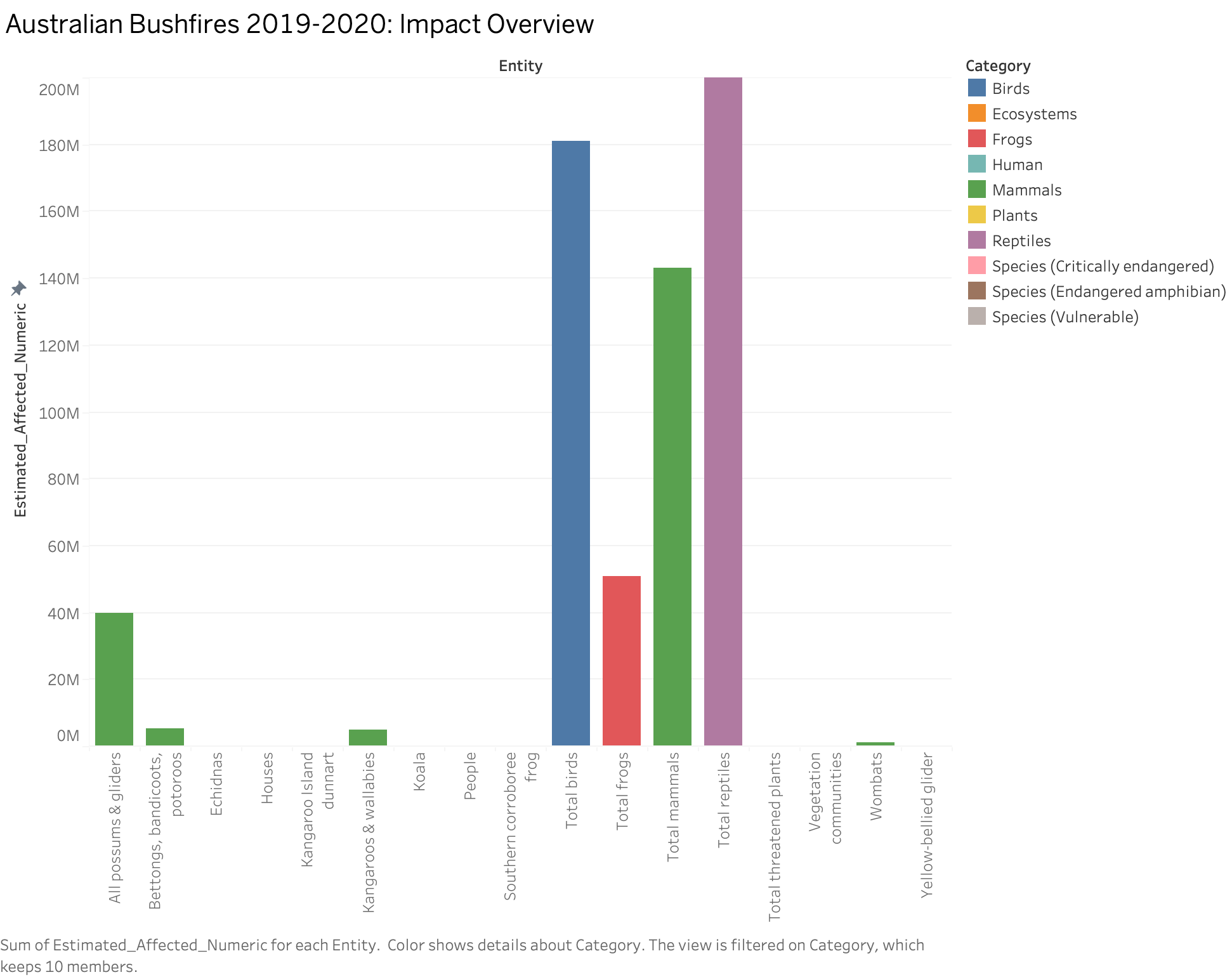
This bar chart provides a powerful overview of the widespread impact of the 2019–2020 Australian bushfires on both human and ecological systems. The data shows that reptiles were the most affected group, with over 200 million estimated impacted individuals, followed closely by birds and mammals. Frogs and specific endangered species also appear in the data, highlighting the broad biodiversity loss. While wildlife suffered the largest numerical toll, human-related entities like houses and people are also represented, emphasizing that the fires were not just an environmental disaster but also a human crisis. Overall, the chart underscores the scale of devastation and the urgent need for coordinated conservation and recovery efforts.
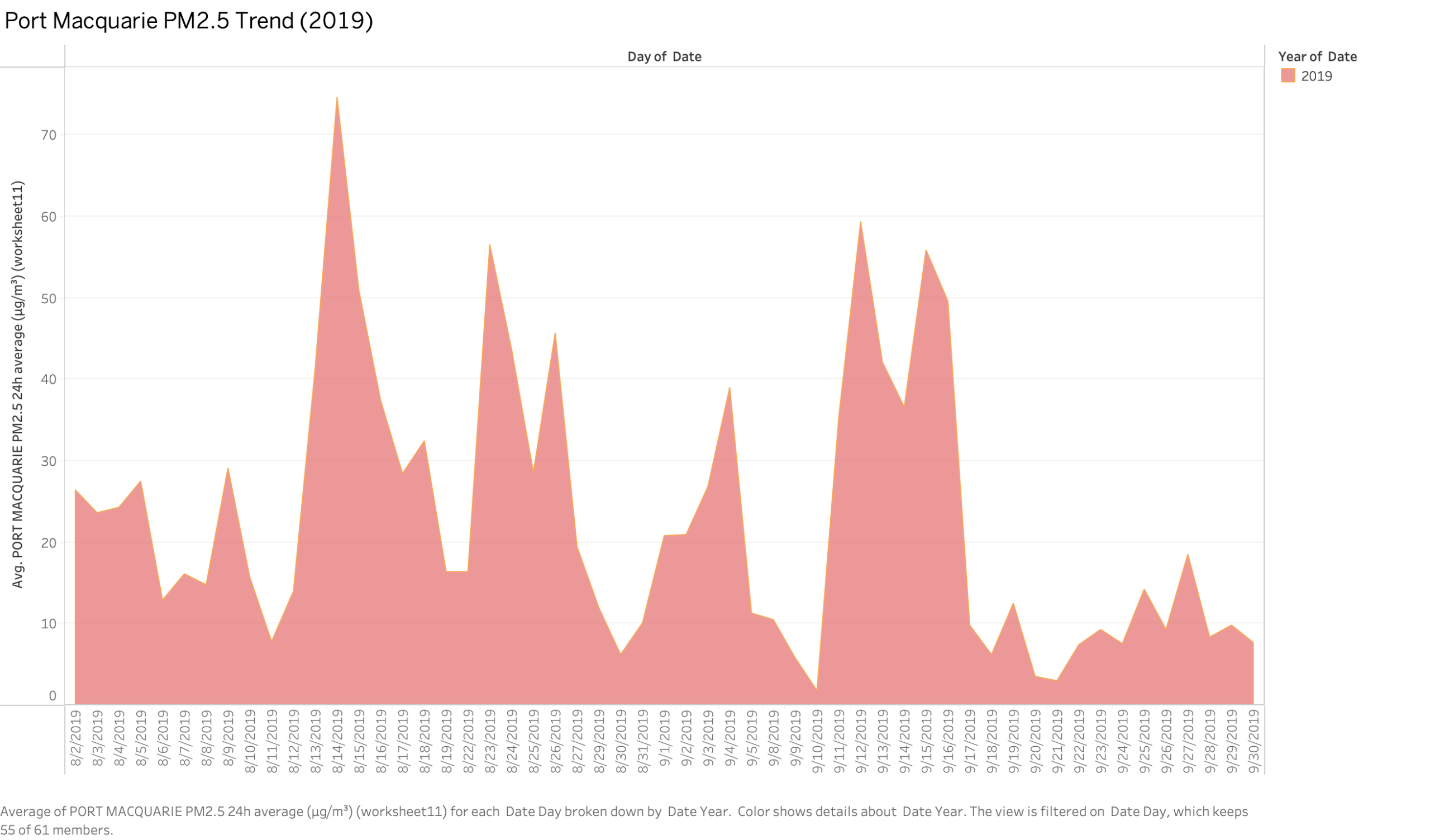
The area chart displays the variation in PM2.5 concentrations in Port Macquarie during August and September 2019. While daily PM2.5 levels fluctuated, several sharp peaks—particularly on August 14 (74.60 µg/m³) and September 12 (59.30 µg/m³)—far exceeded the WHO recommended 24-hour exposure limit of 15 µg/m³. These peaks indicate short but highly intense pollution episodes likely associated with bushfire smoke events in the region. The pronounced variability in PM2.5 levels may reflect shifts in fire fronts, wind direction, and local meteorological conditions.